
This lesson has notes and guides only.
Your date selections will affect what visuals appear on the map.
0:00
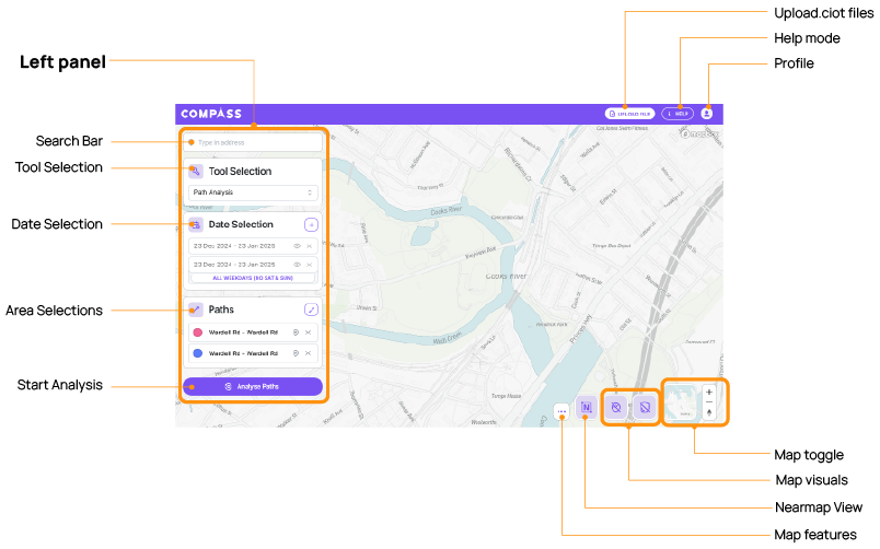
When you first open the platform, you'll notice that on the left-hand side you have a couple of different features that you can use.
0:06
The first one is the Address bar. This allows you to type in cities, roads and different points of interest
0:19
Underneath the Search bar is the Tool Selection panel. This allows you to select between the four different tools that we have in Road Intelligence. This includes Origin-Destination, Path Analysis, Near Misses and Realtime Trajectory.
0:32
Underneath the Tool Selection button is the Date Selection panel. This allows you to edit, add or remove date ranges. The Date Selection tool can be a little bit tricky so I'm going to walkthrough some of the different features that we have. The first thing is you'll want to make sure that Advanced View is turned on. This allows you to see things like WKT files, but it also allows you to open different exclusions and options in a date range. So, when you first log in, the platform will automatically allocate you a date range of about a week. Now you can click into any of the date ranges here to edit them - you can see what that looks like in long form here and that will open up the calendar.
1:11
This also allows you to then change what those date ranges are. Underneath it there are two options you have your Date Options and your Time Options. If you click into your Date Options, this allows you to exclude certain days of the week and exclude certain date ranges. So, for example if you just wanted data for Monday through Friday you could remove Saturday and Sunday from your results.
If you kind of forget what you may have included or excluded from your date ranges, we've added a little bit of a failsafe up here back in the Date Selection panel in so far as it will tell you what you have removed and that changes dynamically.
1:51
For the excluded date ranges, you can select a range, or you can select a particular day. This is really useful for things like public holidays or school holiday periods if you'd like to remove them from your analysis. You can also add multiple exclusions at once, so you can add as many as you'd like here. If you go back up to the long form version of the date and you click into it, you'll see that any dates that you have asked to be excluded from the date range are now greyed out.
2:19
Finally, we have the Zones or the Paths panel. This will change depending on what tool you have selected. So, for example if you're in Path Analysis, you'll see the option for WKT files or paths. Whereas, if you are in say Origin-Destination this turns into zones and that means that you now have WKT, path, but you also have the ability to draw a random zone of your choosing, or a pre-selected boundary. Pre-selected boundaries are things like SA2s, wards, postcodes or county areas. We'll go into this in more detail when we go through each of the individual tools.
2:58
At the top right-hand side of the screen, you have all of your different setting options. This includes uploading a file or a CIOT, your Help options, and also the Profile Icon. This allows you to turn Learning Mode on or off. Learning Mode will provide different tool tips throughout the platform as you click on different things and little pop-ups that you can either hide or show based on the amount of information you might need to perform an action.
3:25
And then User Settings. This is where you have your Advanced View, you can turn your Theme from dark to light, and then you've also got a different Colour Mode between standard and assisted. You also have your Measurement Settings. So, Measurement Settings allow you to switch between metric and imperial. A really cool feature is you don't actually have to have everything in metric and everything in imperial, you can have certain settings in metric and certain in imperial. So, for example, you could choose to have your distance in miles, but you could have your speed in kilometres an hour. You also have your Changelog.
3:59
At the bottom right-hand corner of the screen, you have a few options. You have your different base layer maps, you have your visual layers, and you have your map features. For your Map Layers, you have three different options you have a mono standard, a standard, and then a satellite view.
For your different layers you have your Near Misses, which shows you friction loss events across the network. These can also be filtered by the type of near miss, so whether they are caused by harsh braking, harsh steering, or a combination of both, and also the intensity of the g-force. If you've zoomed out quite a fair way, you'll see these near misses are clumped together in a different hierarchy.
4:38
So, by clicking in and zooming in further into the map, this hierarchy will eventually become small enough that it shows you the individual near misses. In this case, the g-force readings are shown next to those near misses. And if I click into one of these it shows me information about the vehicle trajectory as well as the classification, the g-force, the X and Y acceleration and some other information up the top here.
5:05
The next layer is our G-forces and Speeds, and this shows g-force data on the map, and you can change the absolute g-force and also the speed in kilometres per hour or miles per hour down by moving the little sliders. You also can hover over the individual points to get information about the g-force and the speeds. Note that if you zoom too far out, the platform can't render all the data. So, you need to make sure that you zoomed back in to make sure that the platform can render that.
To toggle any of these layers off, you can either press the little eye icon or you can just double click that icon back off.
5:48
The next layer is Network Speeds. This gives you information about network level aggregates and you have options to choose between different vehicle types, but also different modes - so Raw, Congestion or Speeding - and also Average and Aggregates. So that includes the median, the 85th, and the 15th percentile. There is also a key at the top of the screen here, that indicates what the colours on all of these different edges means and by hovering over these edges you get information about speed limits - the average, median, 85th, and 15th percentile speeds - and you get information about which direction those numbers relate to.
6:26
Finally, we have the Nearmap imagery. You'll see at the top here, a little toast appears to tell you to make sure that you turn your satellite mode on in order to be able to see the Nearmap imagery to use Nearmap imagery, you need to have an existing API key. If you don't have an API key, you can get in touch with our team to figure out how you might be able to get one for your organisation.
We'd love to hear what you think. Leave your details below if you'd like to be contacted.